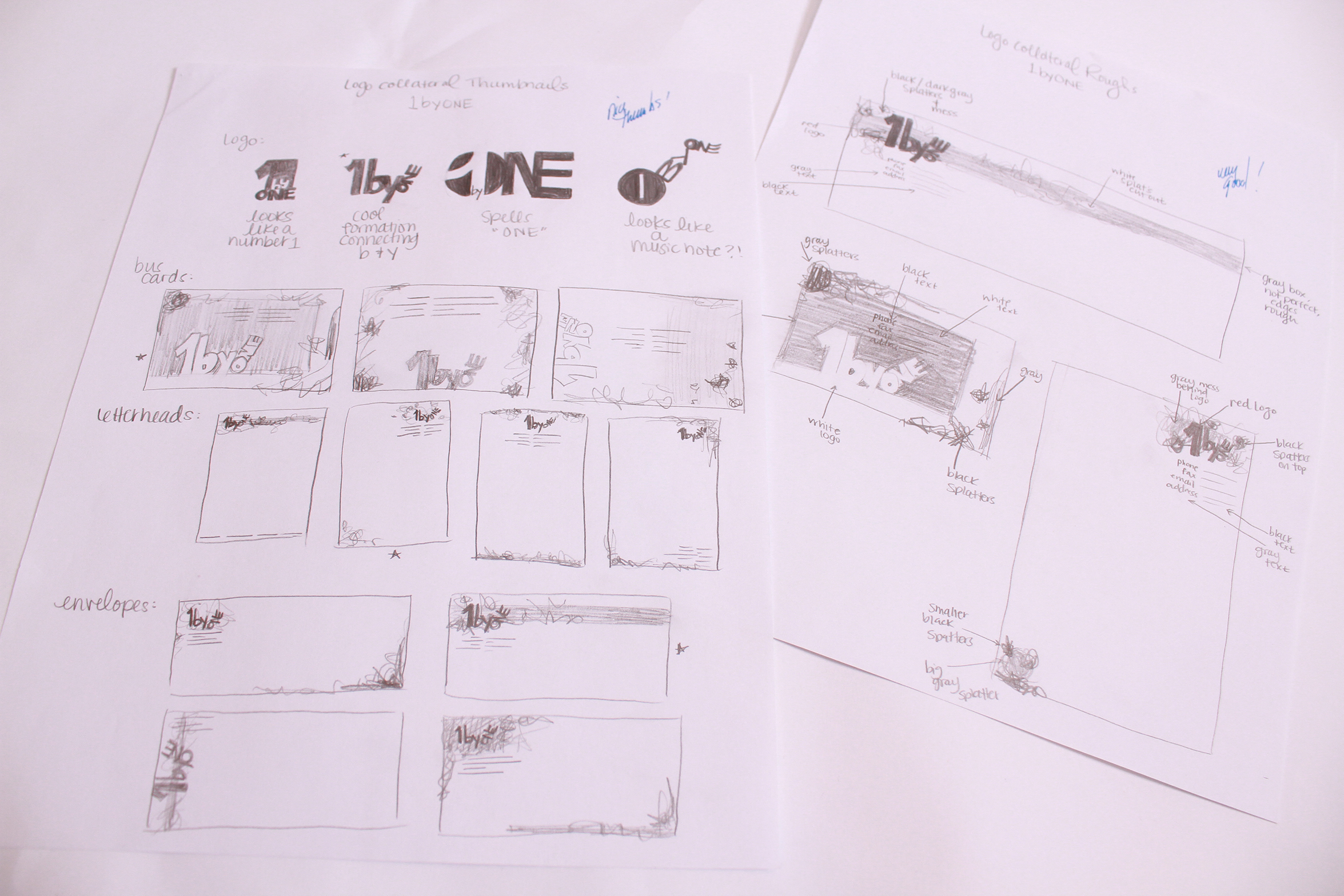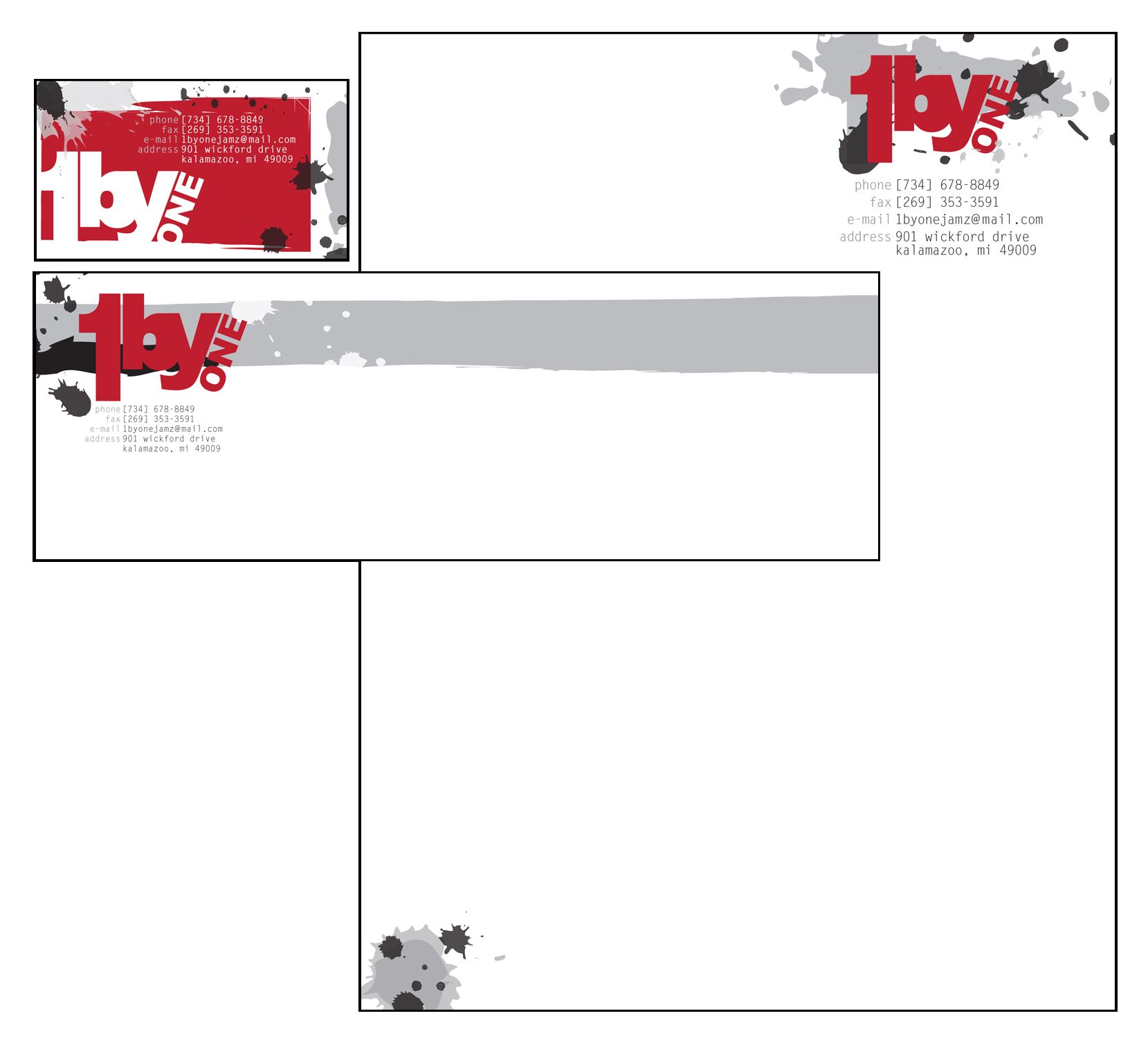

1BYONE
Description: Created branding for fictional rock/alternative record label as spec work. The “1byOne” label claimed to “make bands famous, one by one.” Collateral includes logo design, letterhead, envelope, and business card.
Thought Process: The red in this design represents strength, determination, and passion. Pairing the red with black and gray and using a splatter/brush technique style symbolizes the aggression and rebellion that rock/alternative music embodies.