
SIMPLY SUSHI
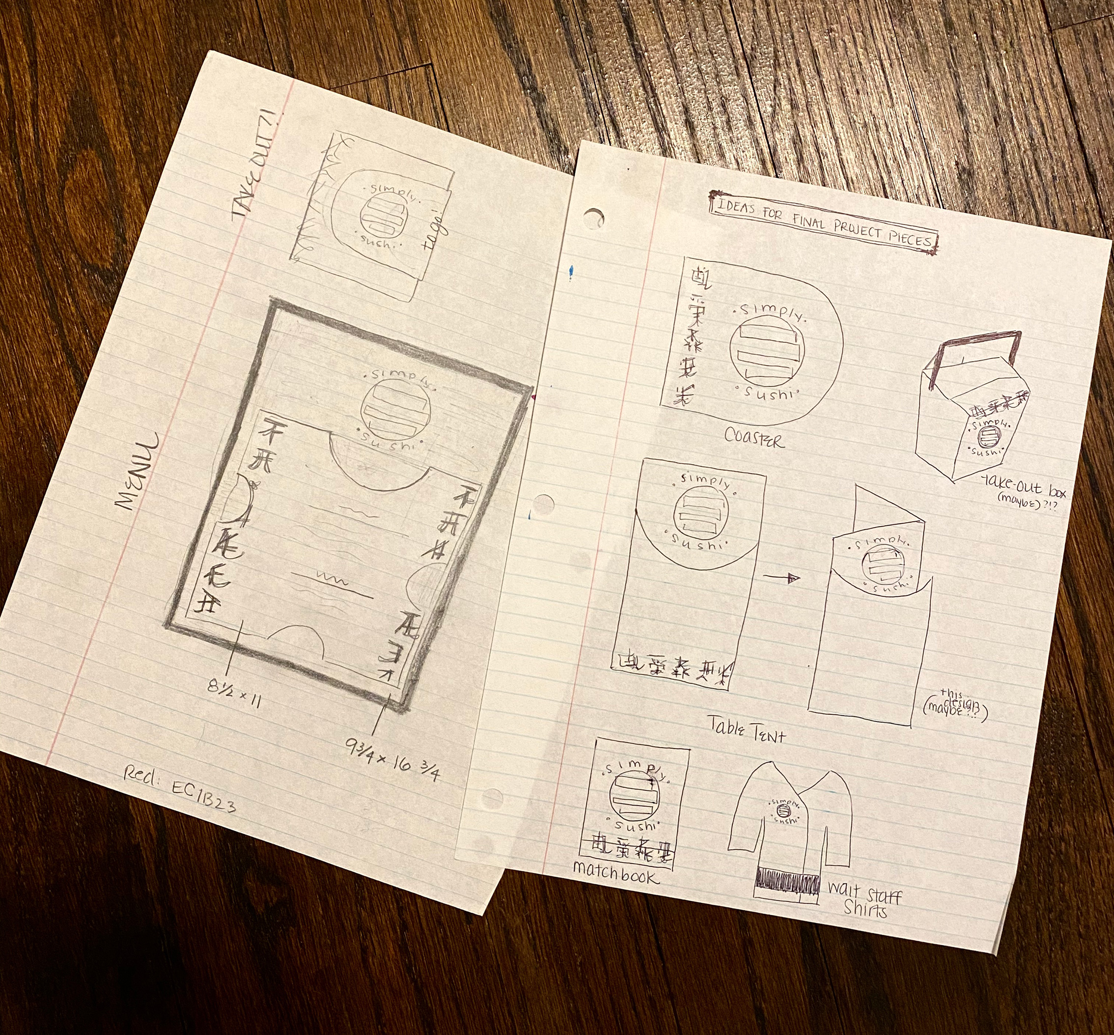
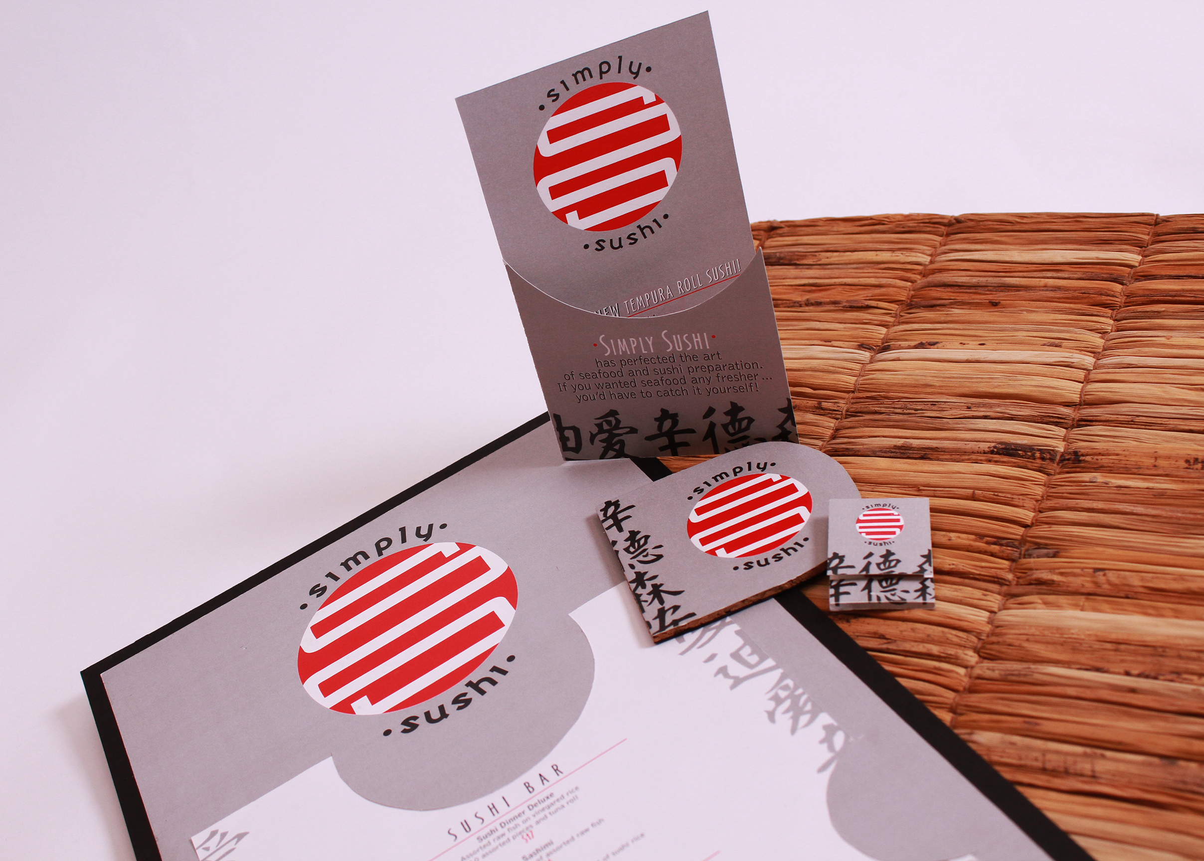
Description: Created branding for fictional “Simply Sushi” as spec work. Described as a new age and urban sushi restaurant. Collateral includes logo design, assembly and design of menu, table tent, coaster, and matchbook.
Thought Process: Red is a major traditional color of Japan and China, used in their flags as well as art and culture. The modern-day concept of sushi originated in Japan then soon trickled into China, so using red along with flat black and gray to encompass a new age ambience made sense. Circular shapes were incorporated where possible to embody the large circle centered on the Japanese flag.